CITISCAPES

My first impression on Lyndon Hayes' piece , that it's very interesting because in his art he only focuses on the parts where he finds it bold and strong and the rest he leaves it but sketches it with faintly lines. His art is pretty simple and unique but still looks amazing. His artwork isn't very extravagant , it's just simple sketches and a little touch of colours to make it standout. His lines are very straight and accurate especially when he draws the people figures , its not very detailed its just the overall shape of it. I also realise that only certain parts of his artworks he just leaves them blank with a little bit of trees background.
By looking at his art style , it's very simple and he uses pastel,natural colours. For the first picture, mostly I like the way he made the bridges to connect two buildings together and the white sky shows the sunny weather that he was drawing this during daylight.
For the second picture, I love how he added the blue to make it look as if the ship was made out of glass, showing the reflection of the sea. I also admire the way he made the wires on the ship look very thin and faint.

My first impressions of Sven Pfrommer’s artwork is that it looks amazing and beautiful. I also love how he uses different building pictures and sticks them in random orders and then uses various pastel colours to paint them over. I would say that his style of this art is very unique and bright as if his artworks came to life like those night city lights on the streets.
The artist used the symbols to tell the story by adding the city names and dates across the artwork. This symbol art has also got me liking his artwork because it’s very interesting how u can write your dates in your art piece, the symbol could be other things as well, like secret codes or the day we went here for a holiday . I like how you can add a story to pieces to give more information about the place.
My opinions on the uses of the typography on the artwork are that I might find it very interesting to work on, especially like the wording styles. I might add the choice of his colour to my art and the placement of the pictures, maybe slightly different by taking some real life pictures and colour them over with acrylic paints and more. I think this style of working would work well with portrait pieces as well. I might take some real life pictures of my classmates and do exactly how the artwork should be made. Different as if instead of buildings and all I could take some pictures of people and combine them with buildings.
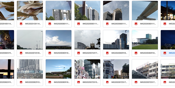
KUALA LUMPUR PHOTOGRAPHY


TAMARIND SQuaRE


